The regional scale model
Daniele Da Re, Sophie 0. Vanwambeke, Matteo Marcantonio
2023-07-27
Source:vignettes/dynamAedes_regional.Rmd
dynamAedes_regional.RmdThis tutorial explains step-by-step the main features of dynamAedes package, a unified modelling framework for invasive Aedes mosquitoes. Users can apply the stochastic, time-discrete and spatially-explicit population dynamical model initially developed in Da Re et al., (2021) for Aedes aegypti and then expanded for other three species: Ae. albopictus, Ae. japonicus and Ae. koreicus Da Re et al., (2022).
The model is driven by temperature, photoperiod and intra-specific larval competition and can be applied to three different spatial scales: punctual, local and regional. These spatial scales consider different degrees of spatial complexity and data availability, by accounting for both active and passive dispersal of the modelled mosquito species as well as for the heterogeneity of input temperature data.
We will describe the model applications for Ae. albopictus and for all spatial scales by using a simulated temperature dataset.
#Load packages
require(spatstat)
require(gstat)
require(parallel)
require(eesim)
require(dplyr)
require(geosphere)
require(ggplot2)
require(terra)
require(rgdal)
require(raster)
require(dynamAedes)

Sys.setlocale("LC_TIME", "en_GB.UTF-8")
# [1] ""Regional scale model
The model at regional scale is the same as running the model at “punctual” scale for each cell of the grid but without accounting for active or passive dispersal. Each cell is therefore a close unit or mosquito population. With this setting, the model requires two input datasets:
- a numerical temperature matrix (in degree Celsius) defined in space and time (space in the rows, time in the columns);
- a two-column numerical matrix reporting the centroid coordinates (in meters) of each cell.
For the purpose of this tutorial, we will use the following simulated datasets:
- A 5 km lattice grid with 250 m cell size;
- A 1-year long spatially and temporally correlated temperature time series;
Prepare input data
Create lattice arena
First, we define the physical space into which the introduction of our mosquitoes will happen. We define a squared lattice arena having 5 km side and 250 m resolution (20 colums and 20 rows, 400 total cells).
gridDim <- 20 # 5000m/250 m = 20 columns and rows
xy <- expand.grid(x=1:gridDim, y=1:gridDim)
We then add a spatial pattern into the lattice area. This spatial pattern will be used later to add spatial correllation (SAC) to the temperature time series. The spatial autocorrelated pattern will be obtained using a semivariogram model with defined sill (value that the semivarion attains at the range) and range (distance of 0 spatial correlation) and then predicting the semivariogram model over the lattice grid using unconditional Gaussian simulation.
varioMod <- vgm(psill=0.5, range=100, model='Exp') # psill = partial sill = (sill-nugget)
# Set up an additional variable from simple kriging
zDummy <- gstat(formula=z~1,
                locations = ~x+y,
                dummy=TRUE,
                beta=1,
                model=varioMod,
                nmax=1)
# Generate a randomly autocorrelated predictor data field
set.seed(123)
xyz <- predict(zDummy, newdata=xy, nsim=1)
# [using unconditional Gaussian simulation]We generate a spatially autocorrelated raster adding the SA variable (xyz$sim1) to the RasterLayer object. The autocorrelated surface could for example represent the distribution of vegetation cover in a urban landscape.
utm32N <- "+proj=utm +zone=32 +ellps=WGS84 +datum=WGS84 +units=m +no_defs"
r <- raster(nrow=gridDim, ncol=gridDim, crs=utm32N, ext=extent(1220000,1225000, 5700000,5705000))

values(r)=xyz$sim1
plot(r)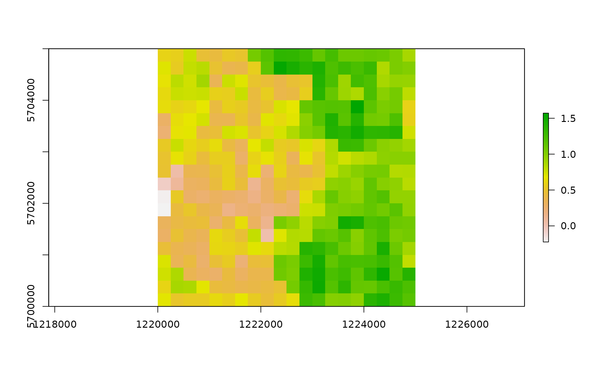
df <- data.frame("id"=1:nrow(xyz), raster::coordinates(r))
bbox <- as(extent(r), "SpatialPolygons")

# Store Parameters for autocorrelation
autocorr_factor <- values(r)
Simulate temperature data with seasonal trend
We first simulate a 1-year temperature time series with seasonal trend. For the time series we consider a mean value of 16°C and standard deviation of 2°C.
ndays = 365*1 #length of the time series in days
set.seed(123)
sim_temp <- create_sims(n_reps = 1,
                        n = ndays,
                        central = 16,
                        sd = 2,
                        exposure_type = "continuous",
                        exposure_trend = "cos1", exposure_amp = -1.0,
                        average_outcome = 12,
                        outcome_trend = "cos1",
                        outcome_amp = 0.8,
                        rr = 1.0055)
A visualisation of the distribution of temperature values and temporal trend.
hist(sim_temp[[1]]$x,
     xlab="Temperature (°C)",
     main="Histogram of simulated temperatures")
plot(sim_temp[[1]]$date,
     sim_temp[[1]]$x,
     main="Simulated temperatures seasonal trend",
     xlab="Date", ylab="Temperature (°C)"
     )
We can then “expand onto space” the temperature time series by multiplying it with the autocorrelated surface simulated above.
mat <- lapply(1:ncell(r), function(x) {
    d_t <- sim_temp[[1]]$x*autocorr_factor[[x]]
    return(d_t)
})

mat <- do.call(rbind,mat)A comparison between the distribution of the initial temperature time series and autocorrelated temperature surface
par(mfrow=c(2,1))
hist(mat, xlab="Temperature (°C)", main="Histogram of simulated spatial autocorreled temperatures")
hist(sim_temp[[1]]$x, xlab="Temperature (°C)", main="Histogram of simulated temperatures", col="red")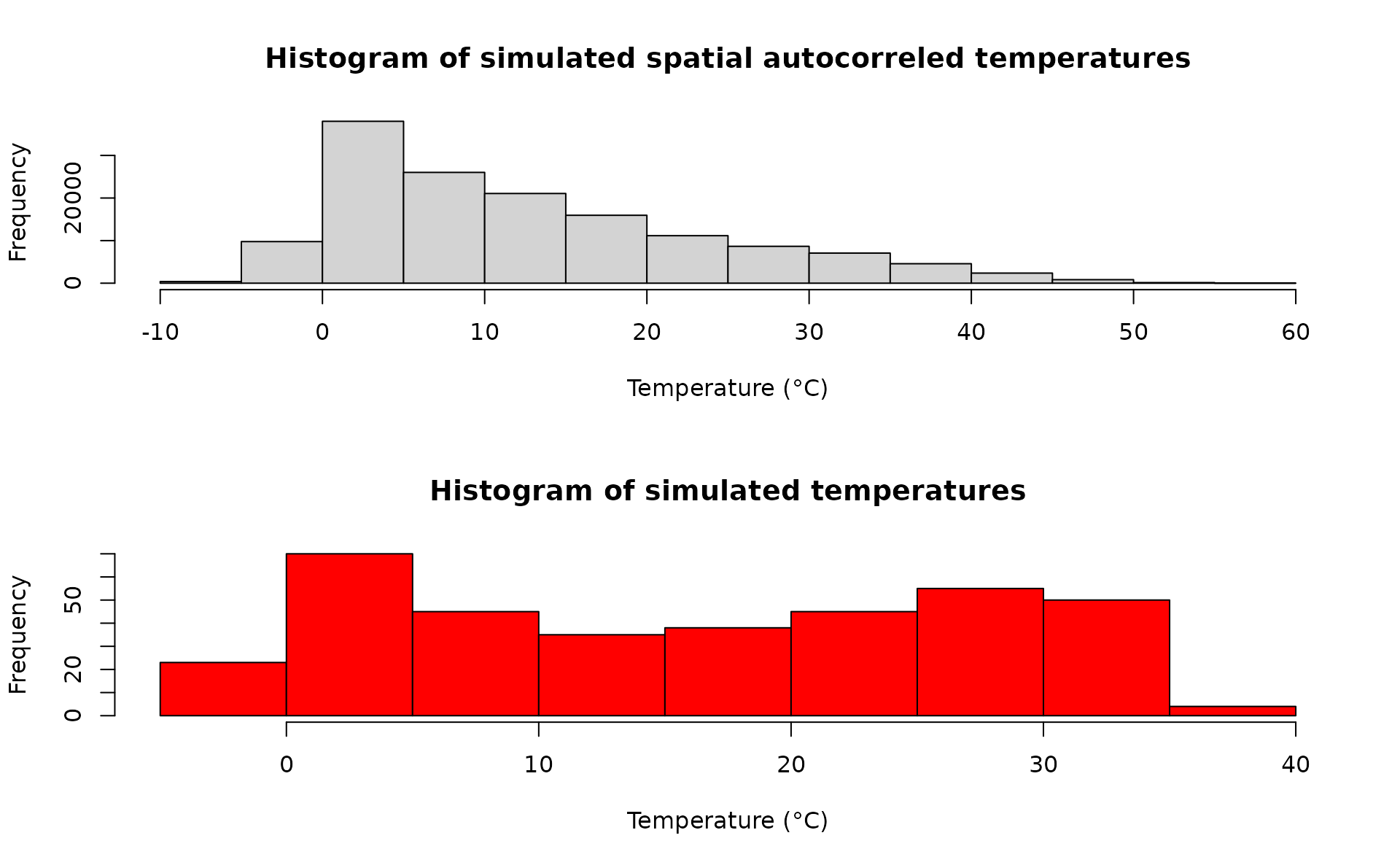
par(oldpar) Format temperature data
Model settings
Float numbers in the temperature matrix would slow the computational speed, thus we first multiply them by 1000 and then transform them in integer numbers. w will be subset to match the simulated time period below.
w <- sapply(df_temp[,-c(1:3)], function(x) as.integer(x*1000))We can now define a two-column matrix of coordinates to identify each cell in the lattice grid.
cc <- df_temp[,c("x","y")]We are now left with a few model variables which need to be defined.
## Define the day of introduction (May 1st is day 1)
str = "2000-06-01"
## Define the end-day of life cycle (July 2nd is the last day)
endr = "2000-07-02"
## Define the number of eggs to be introduced
ie = 100
## Define the number of model iterations
it = 1 # The higher the number of simulations the better
## Define the number of liters for the larval density-dependent mortality
habitat_liters=1
## Define proj4 string for input coordinates
utm32N = "+proj=utm +zone=32 +ellps=WGS84 +datum=WGS84 +units=m +no_defs"
## Define the number of parallel processes (for sequential iterations set nc=1)
cl = 1
Run the model
Running the model with the settings specified in this example takes about 3 minutes.
simout=dynamAedes.m(species="albopictus",
            scale="rg",
            jhwv=habitat_liters,
            temps.matrix=w[,as.numeric(format(as.Date(str),"%j")):as.numeric(format(as.Date(endr),"%j"))],
            coords.proj4=utm32N,
            cells.coords=cc,
            startd=str,
            endd=endr,
            n.clusters=cl,
            iter=it,
            intro.eggs=ie,
            compressed.output=TRUE,
            seeding=TRUE,
            verbose=FALSE)
Analyse the results
We first explore model output structure: the simout object is a nested list.
The first level corresponds to the number of model iterations
print(it)# [1] 1# [1] 1The second level corresponds to the simulated days.
So if we inspect the first iteration, we observe that the model has
computed rlength(simout[[1]]) days, since we have started
the simulation on the 1st of July and ended on the 1st of August.
length(simout[[1]])# [1] 30The third level of the output list object corresponds to the amount of individuals for each stage (rows) within each grid cell of the landscape (columns). If we inspect the first day within the first iteration, we obtain a matrix having
dim(simout[[1]][[1]])# [1] 4 400We can now use the auxiliary functions of the package to Analyse the results.
Derive probability of a successfull introduction at the end of the simulated period
First, we can retrieve the “probability of a successful introduction”, computed as the proportion of model iterations that resulted in a viable mosquito population (in any cells of the grid) at a given date.
psi(input_sim = simout, eval_date = 30)# Days_after_intro p_success stage
# 1 Day 30 1 PopulationWe can also get a “spatial output”, using the function psi_sp, which requires as additional input only the matrix of the pixels coordinates
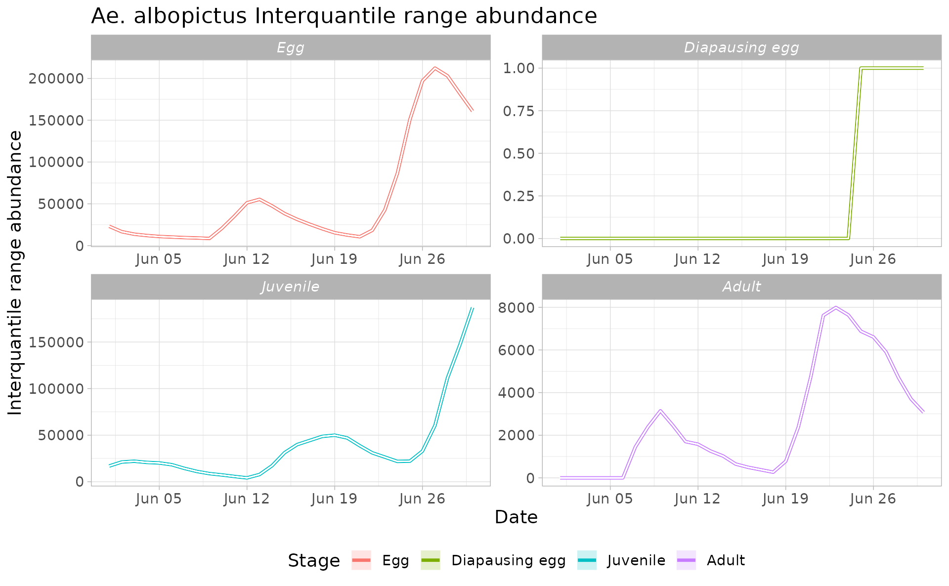
Derive abundance 95% CI for each life stage and in each day
We can now compute the interquantile range abundance of the simulated population using the function adci over the whole landscape.
dd <- max(sapply(simout, function(x) length(x)))#retrieve the maximum number of simulated days
egg <- as.data.frame(adci(simout, eval_date=1:dd, breaks=c(0.25,0.50,0.75), st=1))
juv <- as.data.frame(adci(simout, eval_date=1:dd, breaks=c(0.25,0.50,0.75), st=2))
ad <- as.data.frame(adci(simout, eval_date=1:dd, breaks=c(0.25,0.50,0.75), st=3))
eggd <- as.data.frame(adci(simout, eval_date=1:dd, breaks=c(0.25,0.50,0.75), st=4))

egg$myStage='Egg'
juv$myStage='Juvenile'
ad$myStage='Adult'
eggd$myStage='Diapausing egg'

outdf=bind_rows(egg, juv, ad, eggd) %>%
  as_tibble()

outdf$Date=rep(seq.Date(as.Date(str),as.Date(str)+dd-1, by="day"),4)

outdf %>%
  mutate(myStage=factor(myStage, levels= c('Egg', 'Diapausing egg', 'Juvenile', 'Adult'))) %>%
  ggplot( aes(y=(`50%`),x=Date, group=factor(myStage),col=factor(myStage))) +
  ggtitle("Ae. albopictus Interquantile range abundance")+
  geom_line(linewidth=1.2)+
  geom_ribbon(aes(ymin=`25%`,ymax=(`75%`),fill=factor(myStage)),
              col="white",
              alpha=0.2,
              outline.type="full")+
  labs(x="Date", y="Interquantile range abundance", col="Stage", fill="Stage")+
  facet_wrap(~myStage, scales = "free")+
  theme_light()+
  theme(legend.pos="bottom",  text = element_text(size=14) , strip.text = element_text(face = "italic"))